

A customer portal rarely stays on one page. An order list leads to an order detail, a support form, and an account screen. If each page owns a separate copy of the same colors and component rules, even a small brand change becomes a search through the application.
Flow-Like’s app stylesheet gives those pages a shared visual baseline. Appearance Studio combines controls, a preview, and CSS editing around the same saved stylesheet. A page can still make a deliberate exception. The useful distinction is between a decision that belongs to the whole app and a decision that belongs to one task.
Set the shared style in Appearance Studio
The order list and order detail belong to the same app, so they should agree on colors, typography, and the treatment of common controls. Those shared decisions belong in the app stylesheet. Their different information density can remain a page-level choice.
Open the app’s Appearance Studio. The stylesheet is presented as app.css, with controls and a preview alongside the CSS view. Change the primary accent or the treatment of cards, then save. Both pages use the shared rule, including pages you add later.
The controls and CSS are two ways to work with the same document. You can start with the visual controls and use CSS for a more specific rule without maintaining a second theme. The Appearance Studio implementation reads and saves that stylesheet through the app backend, making it available to everyone using the app’s pages.
Give the exception a reason
Suppose the order list needs compact cards so a support agent can scan many records. The detail page needs more space around a delivery address. Keep the shared colors and borders in the app stylesheet, then adjust the detail page’s spacing in its page styling.
That exception has a clear owner and purpose. Avoid copying the whole app stylesheet into the page just to change one property. Duplicated rules make the next shared change harder to explain because a page may retain an old local value.
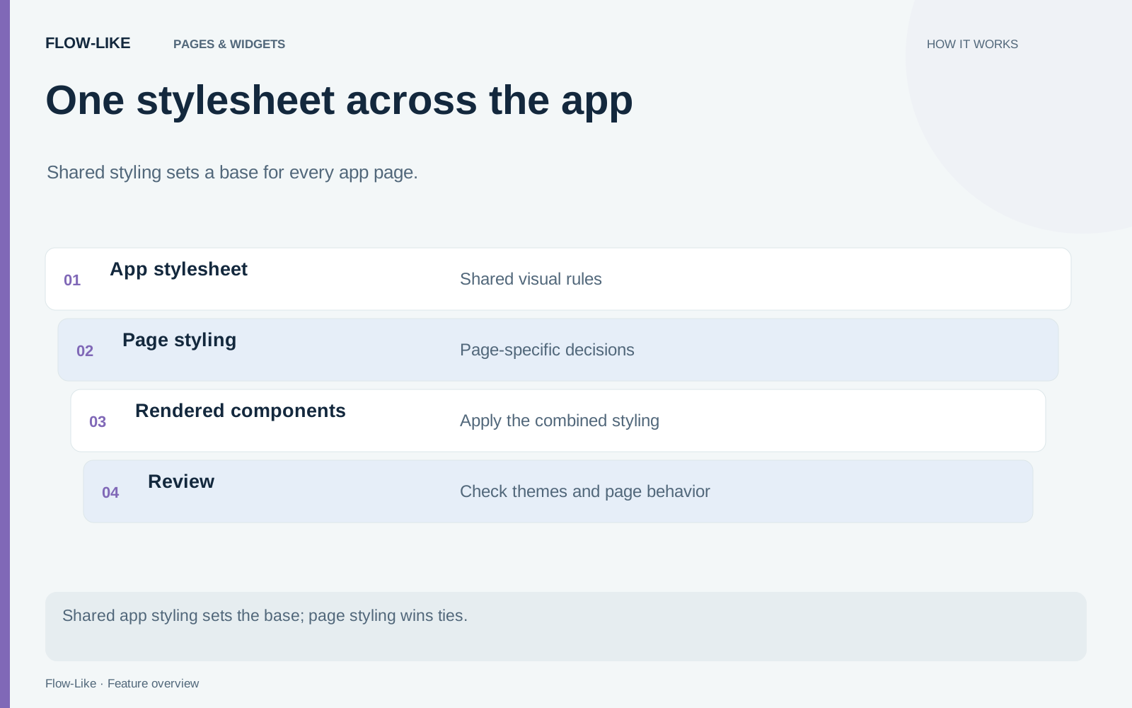
Normal CSS precedence still matters. Flow-Like renders the app stylesheet before the page stylesheet, so the page rule wins when specificity is equal. A more specific app selector can still beat a less specific page selector. If an override appears ineffective, compare the matching selectors before adding more !important declarations. The page renderer documents this ordering beside the stylesheet application.
Keep the app boundary visible
The stylesheet is scoped to the app’s rendered root. This matters when two apps appear in the same document: a rule from one app should not repaint its neighbor. It also means this stylesheet has a different job from styling your personal Profile Home.
Shared styling also gives common states a consistent treatment. A disabled control, a validation message, and a keyboard focus indicator should remain recognizable as a person moves from the order list to a form. Theme colors let that treatment adapt to light and dark appearances without a separate set of hard-coded page colors.
For a small team, a practical maintenance rule is to record the purpose of a page exception beside the rule when that purpose is not obvious. Keep the shared sheet focused on decisions that repeat. A one-off illustration or unusual page layout can remain local.
When the next brand adjustment arrives, change the shared rule once. The order list, detail screen, and support form keep their common identity while retaining the spacing each task needs. Adding another page no longer means copying an entire theme and creating another place for it to drift.
Get automation insights delivered
Sign up for our newsletter to receive the latest updates on Flow-Like, automation best practices, and industry insights. No spam — just valuable content.