
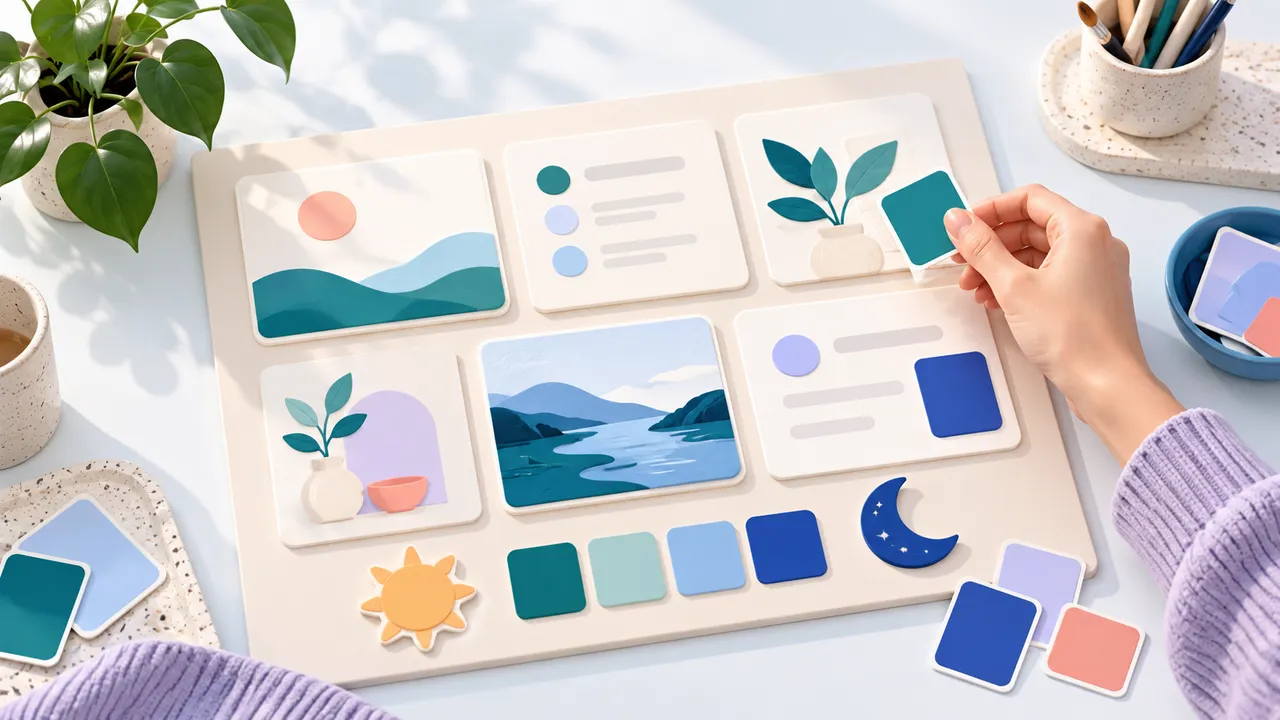
A useful Home dashboard should make the next action easy to find. A consistent card treatment can help: important numbers share one visual language, links look like links, and supporting information stays quiet. Flow-Like lets you make those choices with Tailwind classes and custom CSS on the current Profile’s Home widgets.
Put the widgets you use most near the top, then give related cards the same treatment. For example, daily totals can share a quiet background while the app you open every morning gets a stronger accent. Layout establishes the order; styling helps you read it at a glance.
Make one card work in both themes
Select a widget and find Tailwind classes below Accent in its settings. These classes apply to the widget surface after its built-in surface and accent styling. A restrained starting point is:
rounded-3xl border-primary/40 bg-primary/10This changes the shape, border, and fill while following the theme’s primary color. It avoids fixing every widget to a light background that becomes glaring in dark mode. Inspect the heading, description, and any values inside the card before copying the classes to another widget.
Home compiles Tailwind CSS v4 classes at runtime. The Home styling reference covers the supported syntax and the difference between surface styling and layout. Grid span, position, height, and alignment still belong to the layout controls. Adding a positioning utility does not replace those controls.
Use CSS when the rule needs more room
The Custom CSS field is useful for several related rules or a treatment inside a widget. It accepts plain CSS. Tailwind directives such as @apply belong elsewhere and do not work in this field.
Here is a quiet surface treatment using complete theme colors:
:root {
  background: color-mix(in oklab, var(--primary) 8%, var(--card));
  box-shadow: 0 12px 32px -16px rgb(0 0 0 / 0.25);
}
Within this stylesheet, :root means the widget’s surface. Other selectors reach elements inside that widget. Custom CSS overrides the widget’s Tailwind classes, so keep an eye on properties defined in both places.
Theme variables such as --primary and --card already contain complete colors. Use var(--primary) directly. Wrapping it in another color function can produce invalid CSS. For a saturated background, check secondary text as well as the main heading: descriptions may use --muted-foreground rather than inheriting the surface text color.
Decorative movement deserves a separate decision. If an animation helps convey state, put it inside a prefers-reduced-motion: no-preference media query. A dashboard that people keep open should remain useful when animation is disabled.
Ask FlowPilot for a draft you can inspect
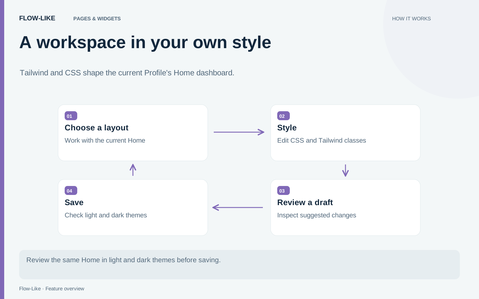
FlowPilot can propose Home styling from a request, including colors or CSS you supply. Give it a concrete target, such as applying the same navy treatment to your statistics widgets while keeping their descriptions readable. Then inspect the staged draft before saving it.
Review which widgets changed, whether their layout stayed appropriate, and how the result behaves in the other theme. The validation can warn about CSS that reaches outside a widget, but visual review still matters. A syntactically valid color combination can be difficult to read.
These changes belong to the current Profile’s Home. They do not become every app’s page stylesheet or an administrator’s default for everyone. Use the Home guide for layout and widget setup, and app Appearance settings when the audience is everyone using a particular app.
Reuse the same treatment across widgets with the same role. A row of statistics becomes easier to scan when labels, values, and supporting text follow a familiar pattern. Keep stronger accents for the places that deserve your next action, and let the rest of Home provide context without competing for attention.
Get automation insights delivered
Sign up for our newsletter to receive the latest updates on Flow-Like, automation best practices, and industry insights. No spam — just valuable content.